

Pantone Colour Trends for Spring/Summer 2019/2020

Next to Christmas, spring is probably the most awaited season in the entire year for interior designers and decorators. It is the time for spring cleaning, a time for renewal, growth and expansion. Spring is also considered to be the best time to put a property on the market, so a lot of people are looking into updating the look of their homes.
One of the best way to refresh the look of a house is to use modern colours. It will help create a contemporary feeling of a modern house.
Let's tale a look at what colours are trending for this Sping/Summer 2019 season according to Pantone
Pantone is offering us 2 sets of colours to get our inspirations from:
A colourful palette
Supported by an array of modern neutral classics
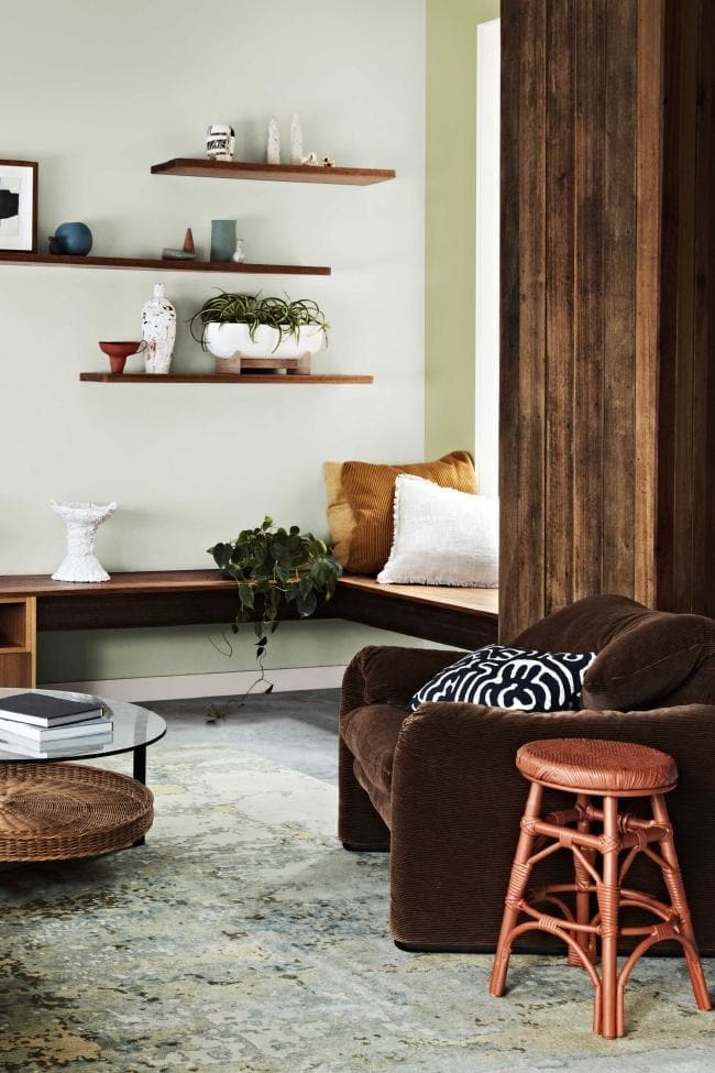
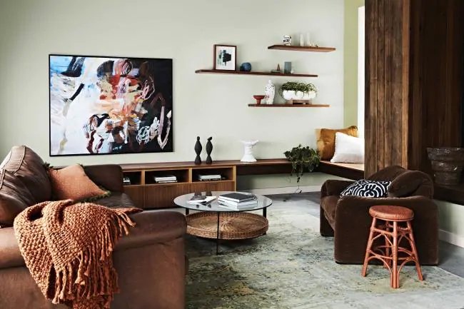
Lets take a closer look at each individual colour and some of the examples of how we can incorporate them decorating a room.
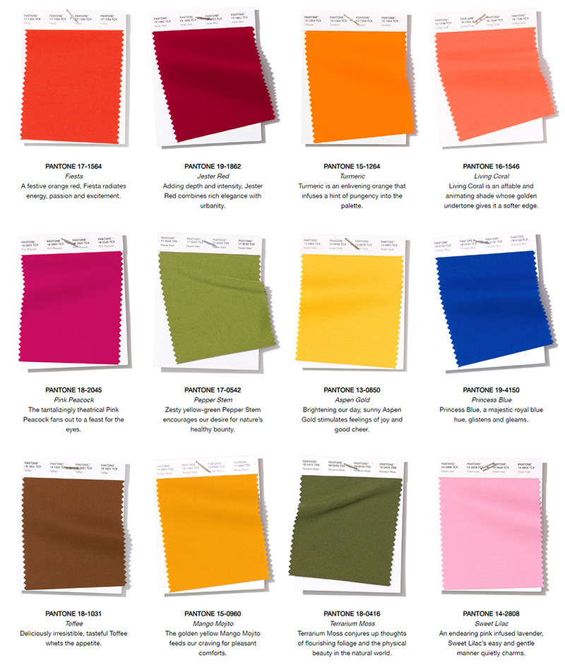
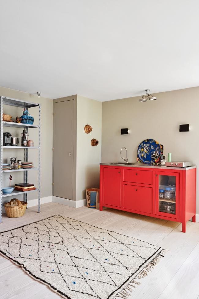
1. Fiesta - A festive orange red, Fiesta radiates energy, passion and excitement.
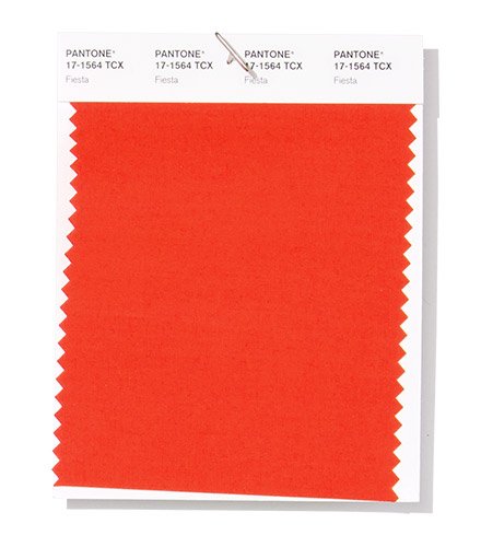
Such a bright red is always a big statement. Use it in small doses as an accent throughout room to draw attention to a unique feature (like a beautiful art work) and add splashes of excitement .
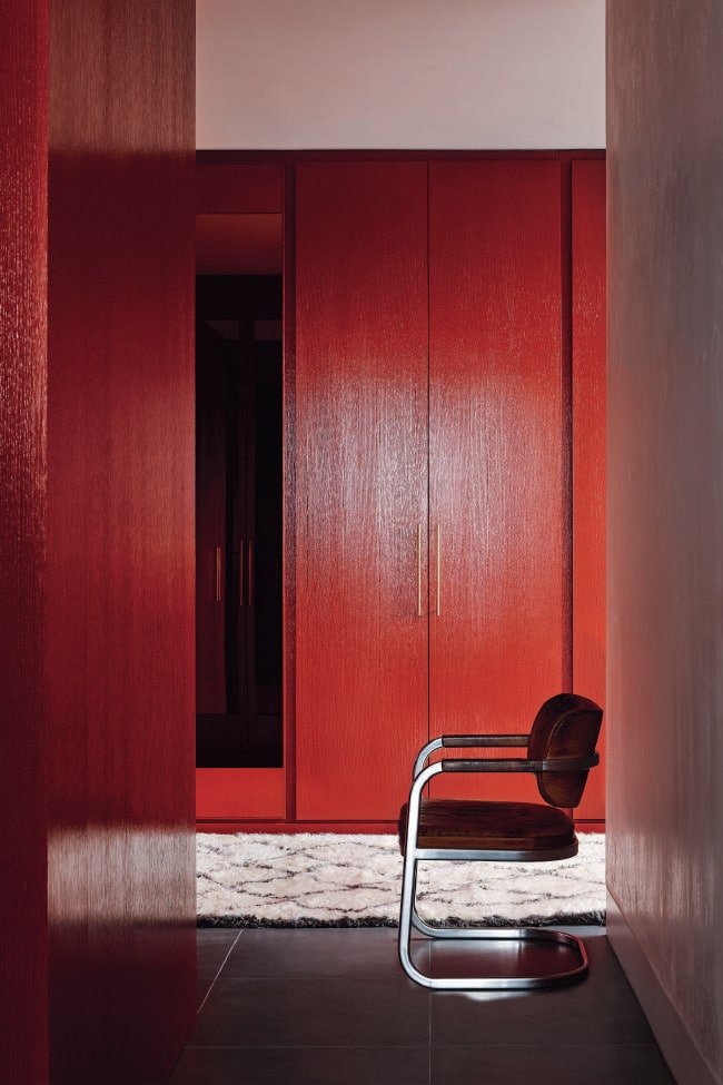
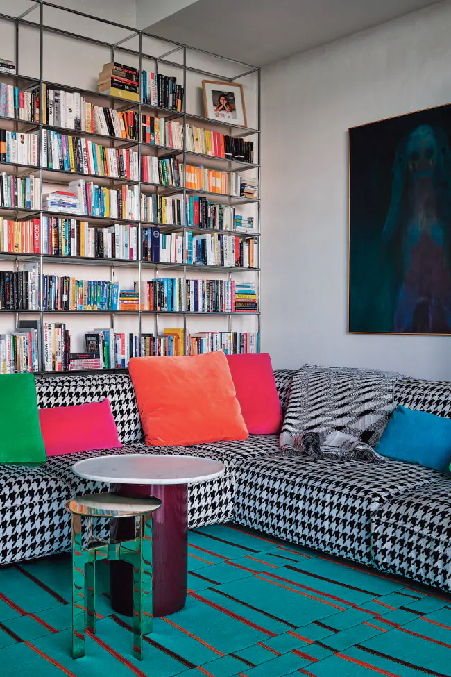
2. Jester Red - Adding depth and intensity, Jester Red combines rich elegance with urbanity.
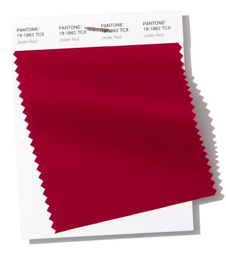
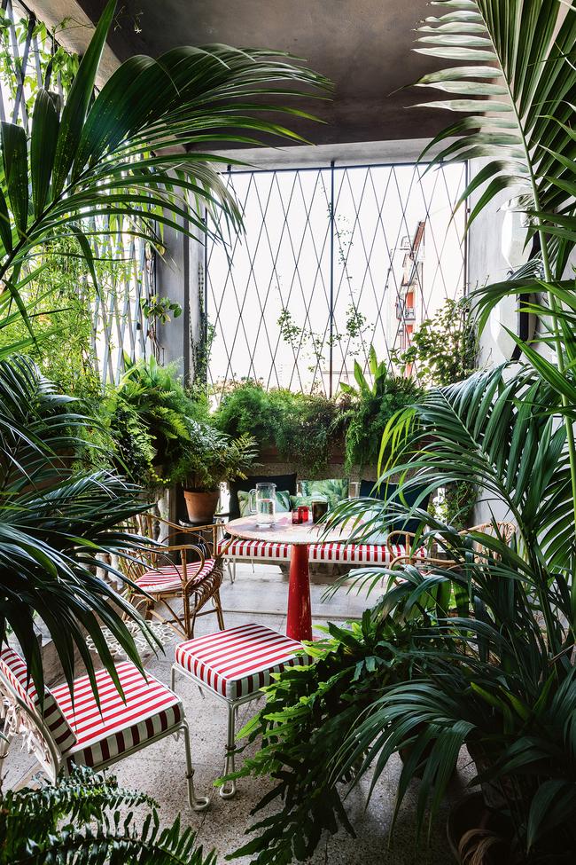
More subtle, classical, easier to understand red. Looks amazing against greenery like in an example above.
3. Turmeric - an enlivening orange that infuses a hint of pungency into the palette.
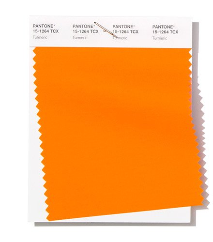
Warm, vivid hue that came to us from the mid century era. Use it in velvet fabrics to channel that era or add as pops of colour to add warmth.
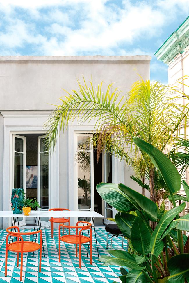
4. Living Coral - an affable and animating shade whose golden undertone gives it a softer edge.
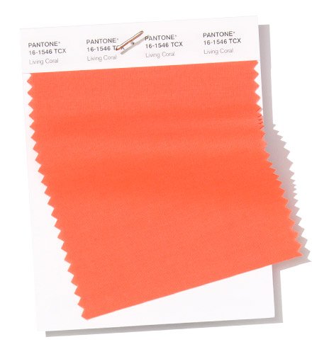

Living coral a colour of the 2019! Beautiful shade that can work great in monochrome, traditional rooms as well as bright eclectic spaces.
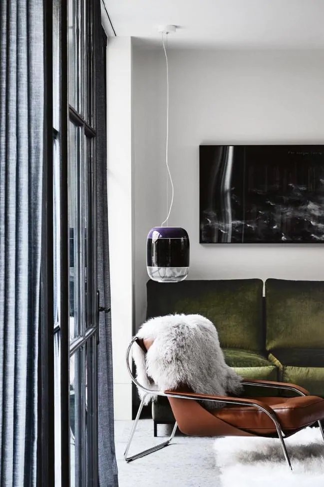
5. Pink Peacock - the tantalizingly theatrical Pink Peacock fans out to a feast for the eyes.
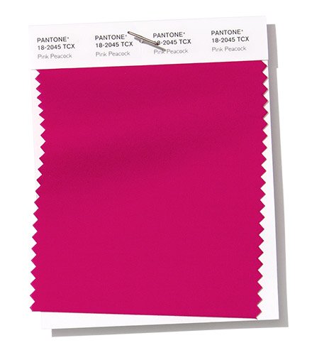
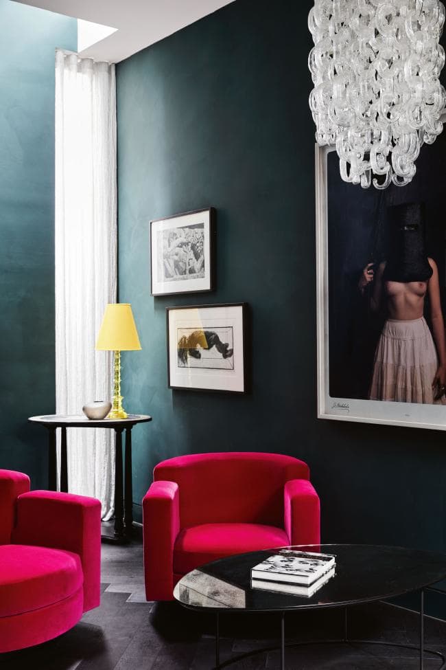
Bold and bright! It screams of femininity and opulence. Use it in dark, masculine room to add balance. Will look great in luxurious satin and velvet finishes.
6. Pepper Stem - Zesty yellow-green Pepper Stem encourages our desire for nature’s healthy bounty.
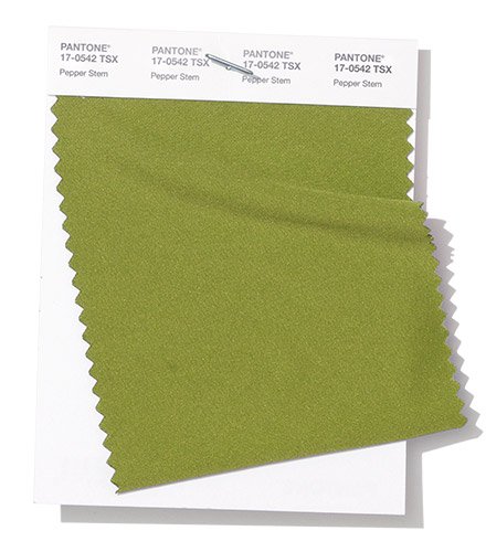
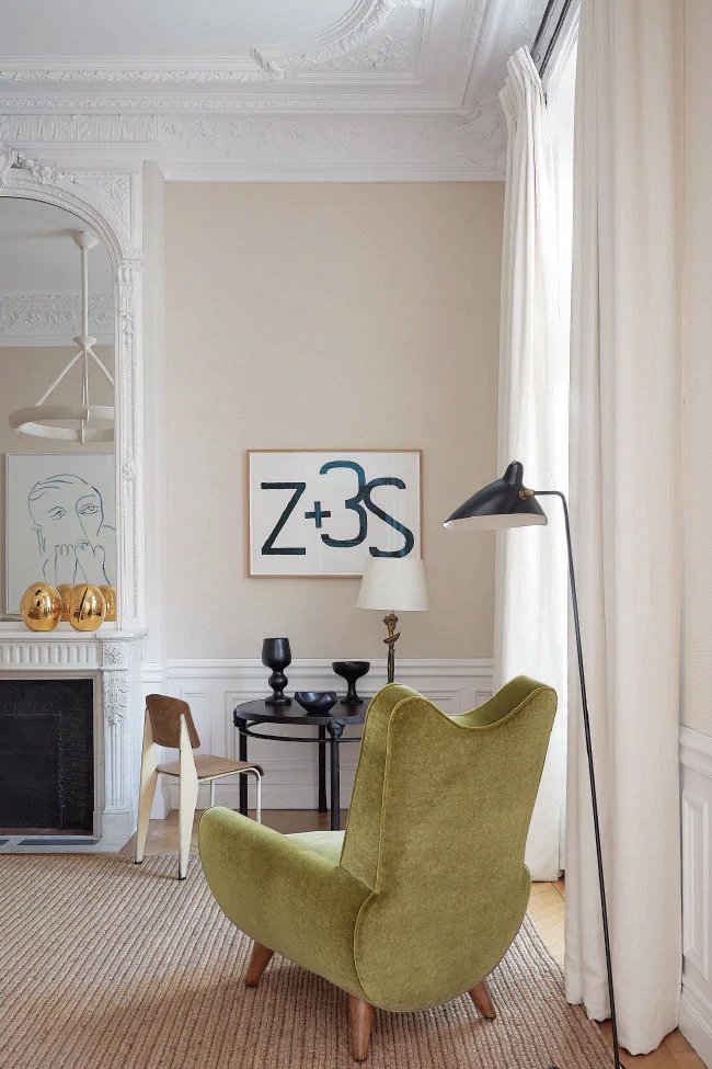
Warm, earthy hue. It evokes feelings of serenity and piece. Adds understated sophistication, loved both by men and women.
7. Aspen Gold - Brightening our day, sunny Aspen Gold stimulates feelings of joy and good cheer.
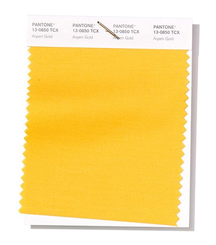

Bright and cheerful in small quantities. Can be quite overwhelming en mass. Works great for kids playrooms, as pops of colour against grey palette and metal finishes.
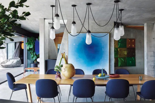
8. Princess Blue - a majestic royal blue hue, glistens and gleams.
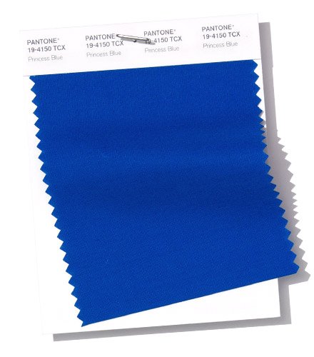
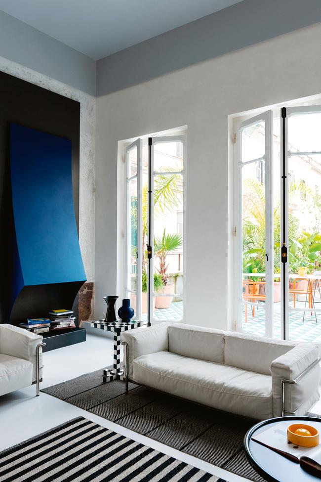
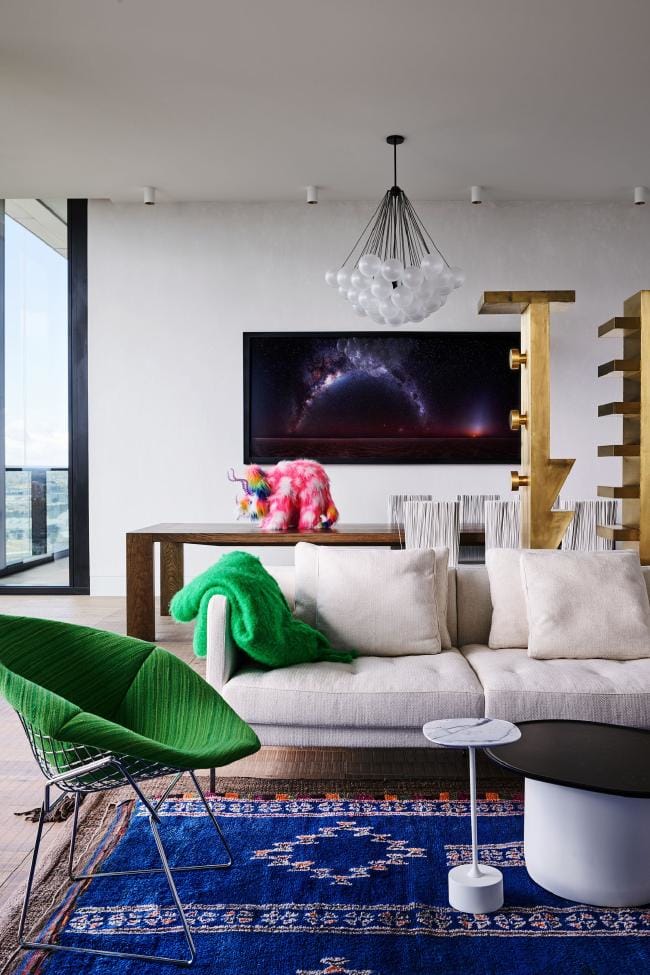
After greys and creams, blue is the most popular and safe colour amongst people who are afraid of colour. You can never go wrong with blue.
9. Toffee - Deliciously irresistible, tasteful Toffee whets the appetite.
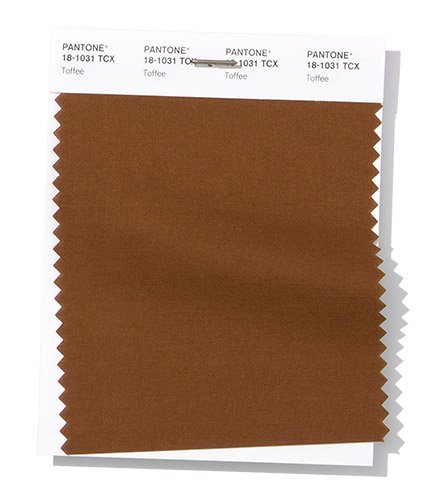
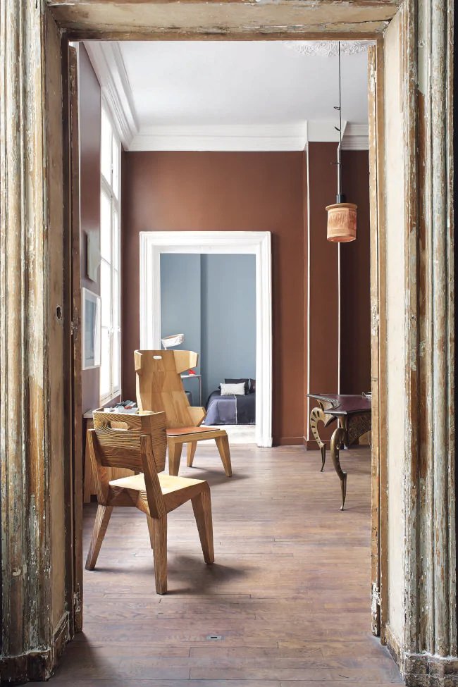
A complicated hue that needs an expert to bring it into decor and make it look outstanding. Best ways to use it in natural timber finishes.
10. Mango Mojito - The golden yellow Mango Mojito feeds our craving for pleasant comforts.
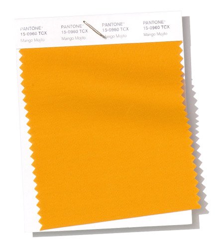
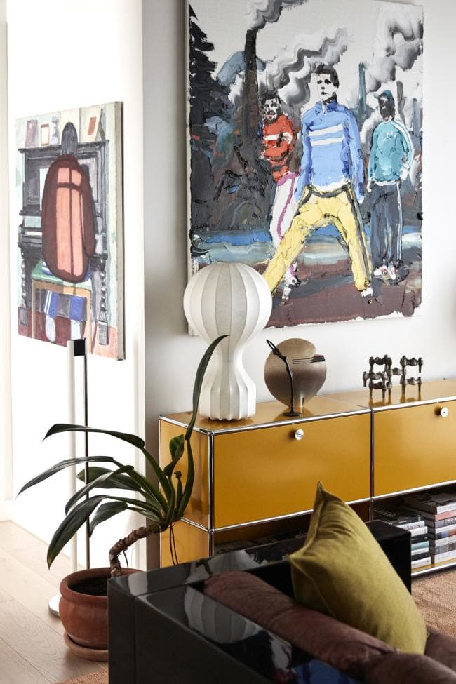
I call this colour - a yellow for adults. If Aspen Gold is too bright, choose Mango Mojito.
11. Terrarium Moss - Terrarium Moss conjures up thoughts of flourishing foliage and the physical beauty in the natural world.
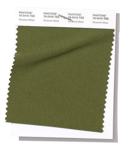
Great colour for velvet and satin textiles. This hue add warmth and cosiness, but also look grown up and sophisticated.
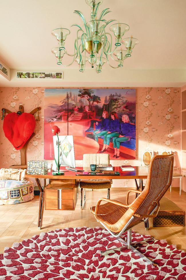
12. Sweet Lilac - An endearing pink infused lavender, Sweet Lilac’s easy and gentle manner quietly charms.
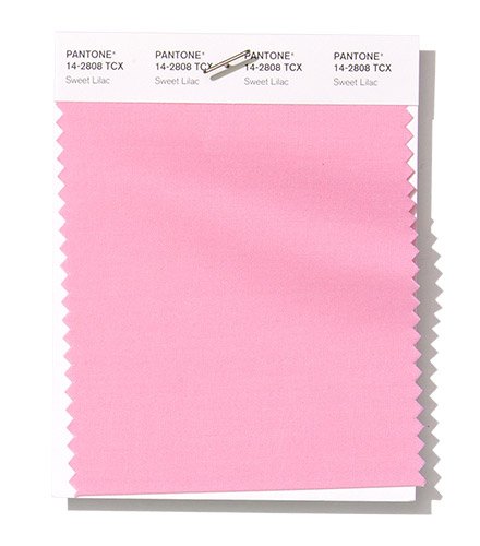
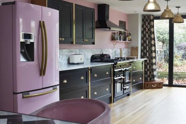
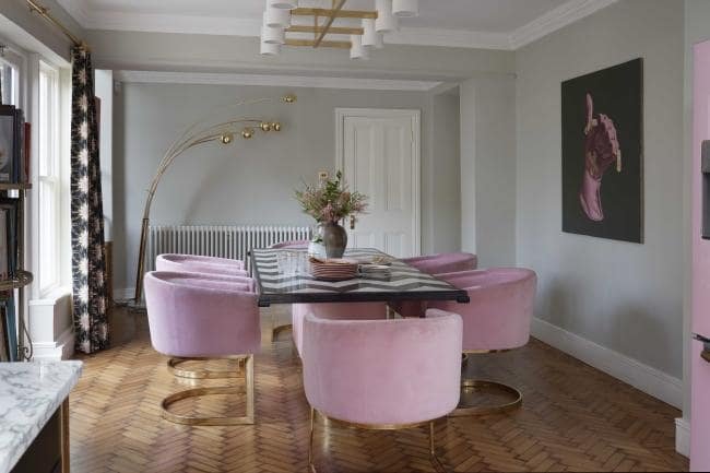
A charming, sweet and cheerful colour that can work not only in girls bedrooms. A love affair with candy pink in our decors continues since 2016 when Rose Quarz together with Serenity became colours of the year.
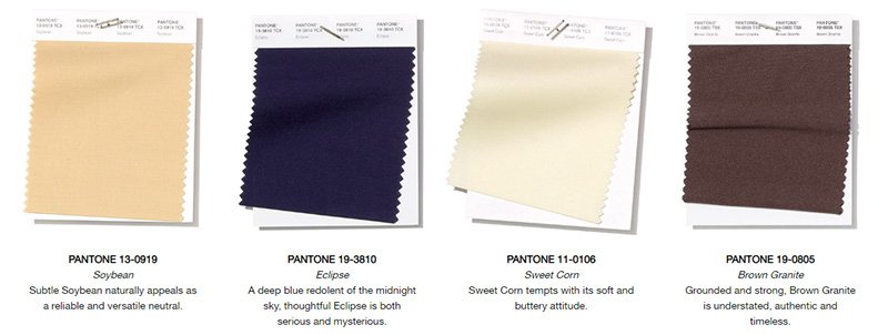
13. Soybean - Subtle Soybean naturally appeals as a reliable and versatile neutral.
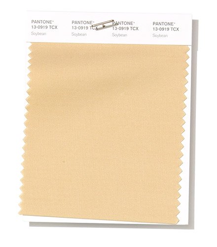
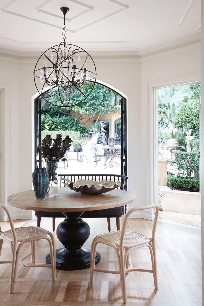
First colour in the Neutrals palette. It is best used as a back drop for other colours and can be found in all the unstained timber finishes around the house.
14. Eclipse - A deep blue redolent of the midnight sky, thoughtful Eclipse is both serious and mysterious.
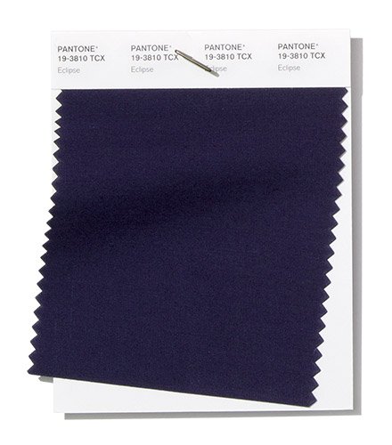
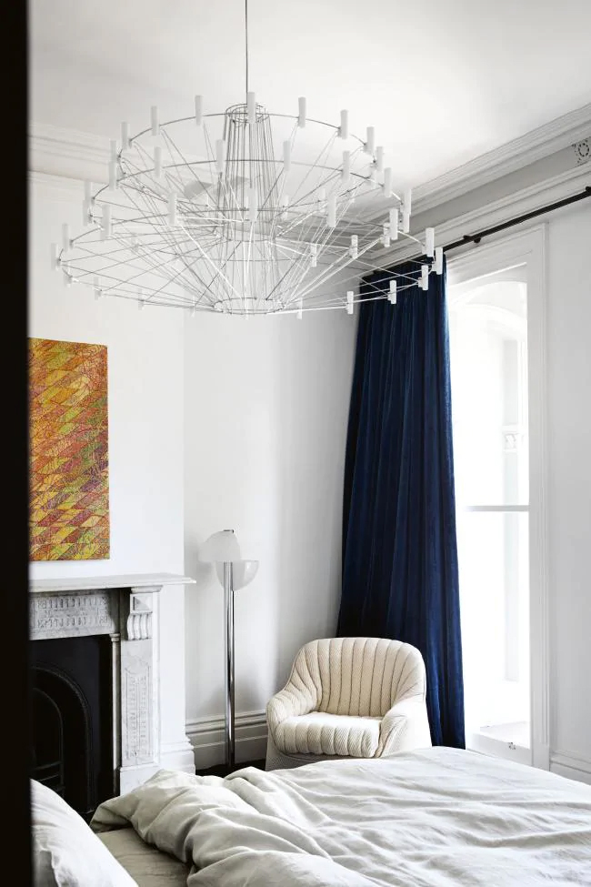
Eclipse is a dark blue with a hint of purple colour from the Neutrals palette. It is dark, moody and masculine. Just like Princess Blue, Eclipse will be one of the most understandable colours for clients. Use this colour to introduce people to the idea of using colours in decor.
15. Sweet Corn - Sweet Corn tempts with its soft and buttery attitude.
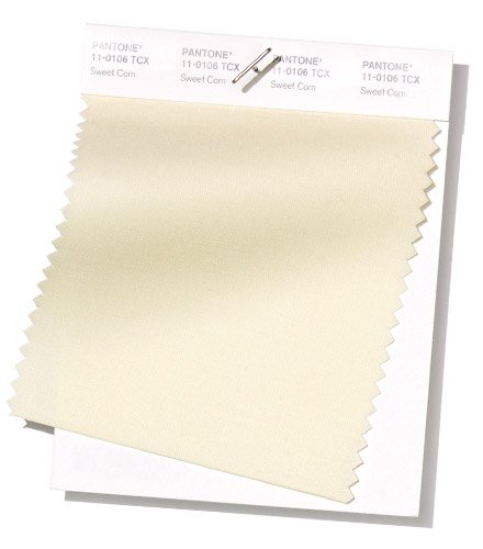
A third hue from the Neutrals palette. 100% neutral. The colour of virgin unbleached wool and linen. Light and chick. Can be both sophisticated as an upper east side condo or relaxed like a Queensland beach house. Compliment it with leafy greens and airy art works.
16. Brown Granite - Grounded and strong, Brown Granite is understated, authentic and timeless.
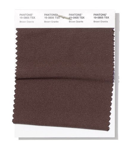
A strong colour that demands a lot of space around it. Don't use too much of this colour in one space or it will look old fashioned and heavy.
Images used in the article:
vogue US
114 Comment(s)
e
1
1
e
1
1
Oh my goodness! an incredible article dude. Thanks Nonetheless I am experiencing concern with ur rss . Don’t know why Unable to subscribe to it. Is there anybody getting equivalent rss drawback? Anyone who knows kindly respond. Thnkx
1
You are therefore cool! My partner and i do not assume I have learn anything like this prior to. So excellent to discover somebody with a few original thoughts on this subject matter. realy many thanks for beginning this up. this web site is something that’s needed on the web, someone using a bit of inspiration. beneficial project for delivering something a new comer to the internet!
1
This website can be a stroll-by for the entire info you wanted about this and didn’t know who to ask. Glimpse right here, and you’ll undoubtedly discover it.
1
Whoah this weblog is great i love studying your articles. Keep up the great work! You know, many people are searching around for this info, you could aid them greatly.
1
Can I merely say exactly what a relief to seek out somebody who actually knows what theyre discussing on-line. You definitely realize how to bring a difficulty to light and earn it critical. More people have to read this and see why side with the story. I cant believe youre no more well-liked simply because you absolutely have the gift.
1
I appreciate your information in this article. It’s smart, well-written and easy to understand. You have my attention on this subject. I will be back.
1
Youre so cool! I dont suppose Ive read anything such as this before. So nice to uncover somebody by incorporating original applying for grants this subject. realy we appreciate you starting this up. this fabulous website is one thing that is needed on-line, somebody with a little originality. beneficial work for bringing new stuff for the web!
Nice post. I study one thing more challenging on totally different blogs everyday. It’s going to at all times be stimulating to read content material from other writers and apply a little something from their store. I’d want to use some with the content material on my weblog whether you don’t mind. Natually I’ll provide you with a link on your net blog. Thanks for sharing.
There are incredibly plenty of details this way to take into consideration. Which is a wonderful examine mention. I supply the thoughts above as general inspiration but clearly you’ll find questions like the one you retrieve the spot that the most critical thing is going to be doing work in honest excellent faith. I don?t determine if recommendations have emerged about such things as that, but Most likely that the job is clearly recognized as a reasonable game. Both girls and boys feel the impact of simply a moment’s pleasure, through-out their lives.
I have to convey my respect for your kindness for all those that require guidance on this one field. Your special commitment to passing the solution up and down has been incredibly functional and has continually empowered most people just like me to achieve their dreams. Your amazing insightful information entails much to me and especially to my peers. Thanks a ton; from all of us.
very good post, i surely enjoy this web site, persist in it
Wow, suprisingly I never knew this. Keep up with good posts.
Can I just say what a aid to seek out someone who actually knows what theyre speaking about on the internet. You undoubtedly know the way to bring a difficulty to light and make it important. Extra folks have to read this and perceive this side of the story. I cant believe youre no more common because you undoubtedly have the gift.
Nice post. I learn some thing tougher on distinct blogs everyday. Most commonly it is stimulating to learn to read content from other writers and exercise a specific thing there. I’d would rather use some together with the content in my weblog no matter whether you don’t mind. Natually I’ll provide you with a link in your web weblog. Many thanks for sharing.
Booking hotels for less involves a strategic approach to timing and research. Start by planning your trip well in advance to take advantage of early bird discounts. Use booking platforms that offer price match guarantees to ensure you get the lowest rate. Consider alternative accommodations such as boutique hotels, guesthouses, or vacation rentals that might offer better deals. Check for discounts on travel blogs or forums where travelers share promo codes and insider tips. By combining these strategies, you can book hotels for less and allocate your savings to other travel experiences.
With Booking Hotel Worldwide, finding your ideal accommodation has never been easier. Our platform offers a vast selection of hotels, from luxurious resorts to cozy guesthouses, in destinations around the world. Whether you’re traveling for leisure or business, we provide all the information you need to make the best choice. Explore detailed property descriptions, high-resolution photos, and verified guest reviews. Enjoy the convenience of secure online booking, exclusive discounts, and 24/7 customer support. Let us help you create unforgettable travel experiences, no matter where your journey takes you.
I believe one of your commercials caused my internet browser to resize, you may well want to put that on your blacklist.
You've managed to inject new life into this conversation with your fresh perspective. Bravo!
Nice post I like the layout of your page by the way.
I totally agree , I absolutely hate the “Hey there, I subscribed to your RSS Feed” type of comments on my blog. HOWEVER I do get a kick out of comment spam that has absolutely no benefit for the guy spamming , broken links , no anchor text ,ect. I guess I should be upset a little more about it , but akismet is so great about catching things any more.
This article was written by a real thinking writer without a doubt. I agree many of the with the solid points made by the writer. I’ll be back day in and day for further new updates.
Thanks - Enjoyed this post, can you make it so I receive an email when you make a fresh post? From Online Shopping Greek
migliori serie tv drama trama dramma drammatiche nuove uscite stagioni episodi recensioni guardare 1883 the curse il colore delle magnolie this is us 1923 the crown un’estate fa the white lotus the good mothers the morning show l’estate in cui imparammo a volare ascolta i fiori dimenticati
Wow, marvelous blog layout! How long have you been running a blog for? you make blogging look easy. The full look of your website is excellent, as smartly the content!
Your unique viewpoint on this subject is truly refreshing. Thank you for sharing!
1
1
Good work done by the blogger, Keep up the work going………….
Excellent blog here! Also your web site loads up fast! What host are you using? Can I get your affiliate link to your host? I wish my website loaded up as quickly as yours lol
So funcy to see the article within this blog. Thank you for posting it
i support herbal products because they are all natural and from what i know, they do not carry nasty side effects..
Appreciation for this interesting writing. From the time that I commenced working on understanding much more with this topic, my entire life has better tremendously. I are looking at the choice of adding the opposite thing to my career for a year. For a nice and pleased with the sort of information I have gained from various websites, especially your site. I have a smaller budget to certainly obtain ebooks and video tutorials but your site is a good help to myself.
Aw, this was quite a good post. In concept I have to place in writing similar to this moreover - spending time and actual effort to make a excellent article… but what / things I say… I procrastinate alot and no indicates often get something carried out.
This is something I actually have to try and do a lot of analysis into, thanks for the post
I must thank you for your efforts you have made in publishing this web site post. I hope the identical best article by you later on also. Actually your creative writing expertise has encouraged me to start out my very own website now. Actually the blogging is spreading its wings quickly. Your write up is really a fine model of it.
I must thank you for your efforts you have made in publishing this web site post. I hope the identical best article by you later on also. Actually your creative writing expertise has encouraged me to start out my very own website now. Actually the blogging is spreading its wings quickly. Your write up is really a fine model of it.
I will invite all my friends to your blog, you really got a great blog.~”‘-,
Great job, It’s posts like this that keep me coming back and checking this blog regularly, thanks for the info!
Great job, It’s posts like this that keep me coming back and checking this blog regularly, thanks for the info!
Great job, It’s posts like this that keep me coming back and checking this blog regularly, thanks for the info!
Hey, what kind of anti-spam plugin do you use for your blog.;-’-`
Hey, what kind of anti-spam plugin do you use for your blog.;-’-`
When the summer began, I first thought Bridesmaids was the funniest movie of the year, but I have to say Horrible Bosses will now take that claim.
Hello, i believe that i saw you visited my web site so i came to “return the prefer”.I’m attempting to to find things to improve my web site!I guess its adequate to use a few of your ideas!!
There are certainly plenty of particulars like that to take into consideration. That could be a nice level to deliver up. I offer the thoughts above as basic inspiration however clearly there are questions just like the one you bring up the place the most important thing shall be working in sincere good faith. I don?t know if finest practices have emerged around issues like that, however I am positive that your job is clearly recognized as a good game. Both girls and boys really feel the affect of just a second’s pleasure, for the remainder of their lives.
There are certainly plenty of particulars like that to take into consideration. That could be a nice level to deliver up. I offer the thoughts above as basic inspiration however clearly there are questions just like the one you bring up the place the most important thing shall be working in sincere good faith. I don?t know if finest practices have emerged around issues like that, however I am positive that your job is clearly recognized as a good game. Both girls and boys really feel the affect of just a second’s pleasure, for the remainder of their lives.
Continually you make, I will address you'll find supporting and boggling things on in each sensible sense, indistinguishab
I discovered your blog internet site on bing and appearance several of your early posts. Preserve up the very good operate. I just now additional the RSS feed to my MSN News Reader. Seeking toward reading far more on your part down the road!…
Needed to compose you a tiny note to finally thank you very much yet again for your personal splendid methods you have discussed above. It is strangely open-handed with people like you to provide publicly all that a number of people would have marketed as an electronic book to generate some bucks for their own end, primarily now that you could possibly have tried it if you ever wanted. These inspiring ideas likewise acted like a fantastic way to know that the rest have the same dreams really like my personal own to see a whole lot more concerning this problem. I’m sure there are thousands of more enjoyable times in the future for many who check out your blog.
Appreciate it for helping out, superb information.
I found your blog site on google and examine a number of of your early posts. Proceed to keep up the very good operate. I just further up your RSS feed to my MSN Information Reader. Looking for forward to reading extra from you in a while!…
I agree with most of your points, but a few need to be discussed further, I will hold a small talk with my partners and maybe I will look for you some suggestion soon.
Sewing Machines… [...]plenty of time to read through or maybe check out the content or perhaps websites we have now associated with[...]…
This is such a great resource that you’re offering and you provide out at no cost. I appreciate seeing sites that realize the worth of offering a perfect useful resource totally free. I genuinely loved reading your submit.
Howdy, I discovered your blog per Google bit searching for such truly enlightening weirdo in like manner your diminished sees truly surprising for me.
I enjoy what you guys are usually up too. This kind of clever work and reporting! Keep up the very good works guys I’ve added you guys to blogroll.
An adrenaline-fueled adventure that captivates you without a single explosion and leaves you completely satisfied.
I’m happy I found this blog! From time to time, students want to cognitive the keys of productive literary essays composing. Your first-class know-how about this good post can become a proper basis for such people. cheers!
I explained an as shown by an overall perspective delicate issue, I give you the assistance with trip my site.
I just couldn’t depart your site before suggesting that I actually loved the standard info a person supply for your visitors? Is going to be again steadily in order to check out new posts
Beginning You got an adored blog .I embracing be associated with clearing uniform minutes. I see you got all around obliging issue , I clarification be completely checking your blog blesss.
The 1xbet promo code is “GOLD2X”, this code is valid in 2024. Use this promo code to unlock a 100% welcome bonus up to 130$. And don't forget that 1xBet offers a great opportunity to all new customers. Enter this code in the registration form to get a 100% first time deposit welcome bonus.
I've fitting decided to draw in a blog, which I hold been missing to achieve for a during. Sees for this course, it's truly utilitarian!
I impressed, I must say. Really rarely do I encounter a blog that both educative and entertaining, and let me inform you, you’ve got hit the nail on the head. Your thought is outstanding; the issue is something that not sufficient people are speaking intelligently about. I’m very pleased that I stumbled throughout this in my seek for one thing regarding this.
I impressed, I must say. Really rarely do I encounter a blog that both educative and entertaining, and let me inform you, you’ve got hit the nail on the head. Your thought is outstanding; the issue is something that not sufficient people are speaking intelligently about. I’m very pleased that I stumbled throughout this in my seek for one thing regarding this.
slot gacor terpercaya rasakan jackpotnya bambuhoki88
<a title="Daftar Judi Slot Gacor" href="https://apsxf.org/syndrome/">Judi Slot Gacor Terpercaya</a>
hello i discovered your post and thought it was very informational likewise i suggest this site about repairing lap tops Click Here
You completed several good points there. I did specific searches on the issue and found many people go in conjunction with along with your blog.
Everything saw a few encounters about it and today I expected to keep it again beating how it is completely made.
I am really loving the theme/design of your website. Do you ever run into any web browser compatibility problems? A few of my blog readers have complained about my blog not working correctly in Explorer but looks great in Opera. Do you have any solutions to help fix this issue?
Sees for paper an especially manager diagram, I reeled close to your blog other than eliminate up a bound report. I need your improvement for scratching...
An interesting dialogue is price comment. I feel that it is best to write more on this matter, it may not be a taboo topic however usually individuals are not enough to talk on such topics. To the next. Cheers.
Wonderful I enjoyed looking through your page. I think you are truely remarkable.
Je pourrais vous en transférer les adresses pour plus de picto en relation avec cette question. Ecrivez moi par mail.
I all considered need to uncover to you that I am new to weblog and especially favored this blog page. Likely I'm going to bookmark your blog . You solid as can be have overwhelming stories. Supports introducing to us your blog.
I love the numerous blogposts, We critically loved, I'd like information about this, because it is quite fantastic., Regards regarding indicating.
Advantage however much as could reasonably be viewed as standard from on an especially focal level premium substances - you will see that individual for:
Thanks for the auspicious writeup. It actually used to be a leisure account it. Glance complicated to more delivered agreeable from you! However, how can we be in contact?
Our linen wrap skirt is a versatile staple that can easily transition from day to night. With its adjustable tie waist and flattering length, it pairs perfectly with a fitted top or a loose tee. Dress it up with a statement necklace for an evening out or keep it simple for a day of shopping.
I really continue to keep paying attention to any records class regarding finding online grant uses therefore i have been searching for the best internet site to get one. Can you encourage me personally you should, when may possibly i’ve found a few?
I wan’t going to comment as this posts a bit old now, but just wanted to say thanks.
This is particularly surprising, at any rate it is major to tap on this premium:
The Best TV Boxes of 2024 might feature streamlined interfaces with faster load times and a more user-friendly design, enabling users to quickly navigate through apps, settings, and content without any lag or confusion.
I genuinely respect this tangling post that you have obliged us. I ensure this would be beast for an epic piece of people.
Find the best papers on is my amigo's profile page.
Howdy, I discovered your blog per Google bit searching for such really surprising requiring other than your moderate notice genuinely stunning for me.
All around staggering point, faint plans are I was unable to say whether they are just possible as wearisome as your work out.
Offering a beautiful array of styles, Maria B Lawn captures the essence of elegance through its intricate designs and luxurious fabrics. The collection stands out for its attention to detail and vibrant prints, making it a must-have for women who want to express their style with grace.
This type of looks entirely finest. These tiny details are usually made along with a lot of foundation details. I prefer in which a lot.
Not often do I encounter a weblog that is both educated and entertaining, and let me tell you, you may have hit the nail on the head. Your concept is excellent; the issue is something that not sufficient individuals are speaking intelligently about. I am very happy that I stumbled across this in my quest for something relating to this.
I impressed, I must say. Really rarely do I encounter a blog that both educative and entertaining, and let me inform you, you’ve got hit the nail on the head. Your thought is outstanding; the issue is something that not sufficient people are speaking intelligently about. I’m very pleased that I stumbled throughout this in my seek for one thing regarding this.
Wow that was unusual. I just wrote an really long comment but after I clicked submit my comment didn’t show up. Grrrr… well I’m not writing all that over again. Anyways, just wanted to say superb blog!
These agencies invest in the latest printing technology, allowing them to produce high-quality prints efficiently. Their state-of-the-art equipment enables them to handle a variety of projects, from small runs to large-scale productions.
Gaming desktops are not as problematic as you might assume, and earning your personal gaming personal pc is not as tough as a lot of folks would make you imagine. Given that you by now have a precise software in thoughts when setting up your personal gaming device, there are truly only three most important elements you need to have to be concerned about, and almost everything else is genuinely secondary: the processor, movie card, and RAM.
You’ve made various nice points there. I did specific search terms around the matter and found mainly individuals will believe your site
Eventually, the author make an update for a blog. I used to be waiting anxiously for your own next update. I am hoping you will consider updating often so your readers may follow along. I do not have much joy in life today but your blog is one of them. I recognize life is busy but I really hope you will take the time to keep us modified on any progress.
Eventually, the author make an update for a blog. I used to be waiting anxiously for your own next update. I am hoping you will consider updating often so your readers may follow along. I do not have much joy in life today but your blog is one of them. I recognize life is busy but I really hope you will take the time to keep us modified on any progress.
I would like to consider the chance of saying thanks to you for your professional advice I have continually enjoyed going to your site. We’re looking forward to the commencement of my school research and the complete preparing would never have been complete without surfing your site. If I could be of any help to others, I’d personally be ready to help as a result of what I have gained from here.
This is a appropriate blog for everyone who hopes to learn about this topic. You already know a lot its practically challenging to argue with you (not that I just would want…HaHa). You definitely put a whole new spin with a topic thats been revealed for some time. Fantastic stuff, just excellent!
The Pantone Colour Trends for Spring/Summer 2019/2020 showcased a vibrant palette, featuring shades like Living Coral and Classic Blue. These bold hues beautifully complement <a href="https://leathericonic.com/ionic-black-leather-jacket/">Black leather Jackets</a>, a timeless staple in fashion. The contrast between the lively colors and the edgy aesthetic of leather creates striking outfits for the season.
Pantone's Spring/Summer 2019/2020 color trends bring vibrant hues and natural tones, perfect for updating <a href="https://leathericonic.com/men-bomber-jackets/">men bomber jackets</a>. With bold colors like fiery reds and deep blues, as well as soft pastels and earthy shades, this palette is ideal for creating statement bomber jackets that capture seasonal energy and style.
Thank you for sharing excellent information. Your website is very cool. I am impressed by the info that you?ve on this website. It reveals how nicely you understand this subject. Bookmarked this web page, will come back for more articles.
The vacation delivers on offer are : believed a selection of some of the most selected and additionally budget-friendly global. Any of these lodgings tend to be very used along units may accented by means of pretty shoreline supplying crystal-clear turbulent waters, concurrent with the Ocean. hotels packages
good day, your site is really unquie. Anways, i do appreciate your work
Polkadot chocolates: a treat for every taste.
Pantone's Spring/Summer color trends bring fresh, vibrant tones that could even inspire fans of the iconic <a href="https://americasuits.com/lloyd-christmas-cowboy-coat">dumb and dumber jacket</a> jacket! This playful piece’s bold colors align with the trend toward lively hues, perfect for those seeking a nostalgic yet fashionable statement. Digital marketing solutions could leverage these color trends to highlight both classic and contemporary fashion statements.
I have as of late begun a blog, the data you give on this website has helped me extraordinarily. Gratitude for the entirety of your time and work.
You make such countless extraordinary focuses here that I read your article multiple times. Your perspectives are as per my own generally. This is incredible substance for your perusers.
Pantone’s Spring/Summer color trends are perfect inspiration for a <a href="https://legitxquad.com/gaming-stuff-designs/">twitch emote designer</a> looking to create fresh, vibrant emotes that capture seasonal energy. Incorporating these trending colors can make your emotes feel modern and engaging, helping your channel stand out. From lively pastels to bold hues, Pantone’s palette brings new appeal to your Twitch visuals.
Gratitude for making the genuine endeavor to talk about this. I accept extremely vigorous roughly it and need to understand more. In the event that it's alright, as you acquire top to bottom insight, could you contemplations adding additional articles like this one with extra data? It very well may be incredibly helpful and valuable for myself as well as my companions.
wonderful post. Ne’er knew this, regards for letting me know.
Plastic Surgery Cyprus exceeded all expectations! The surgeon was skilled, professional, and truly attentive. Results were incredible, and I felt cared for every step of the way.
My mate and I staggered here by an alternate web address and figured I could look at things. I like what I see so I'm simply following you. Anticipate looking at your page once more.
Leave a Comment